The Two Big Mismatches
1. The "Stretched Image" Problem
Your creative file is too small for the screen. Think of trying to print a low-res Instagram photo on a massive billboard. It’s going to look blurry and pixelated. Your screen’s processor has to stretch those few pixels to fill all the available space, and the result is never pretty.
2. The "Overkill" Problem
Your creative file is much larger than the screen's resolution. While this sounds better than the first scenario, it’s still a waste. The screen has to crush all that extra data down to fit, discarding the detail you paid for. You’re using more bandwidth and storage for zero visual benefit, and sometimes even introducing playback stutter.
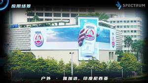
The Real-World Impact: Blurry Logos and Unreadable Text
When your resolutions don’t match, you get:
The Blur: Images lose their sharpness. Details vanish. Your high-tech display looks dated instantly.
The Pixelation: Jagged, stair-stepped edges appear on text and logos. It screams unprofessional.
The Unreadable Text: Your key message becomes a fuzzy, hard-to-decipher blob. You lose communication in a heartbeat.
Wasted Budget: You paid a premium for a crystal-clear canvas. Why sabotage it with the wrong "paint"?
The Professional's Fix: It's Simpler Than You Think
Forget complex calculations. Getting it right boils down to three clean steps:
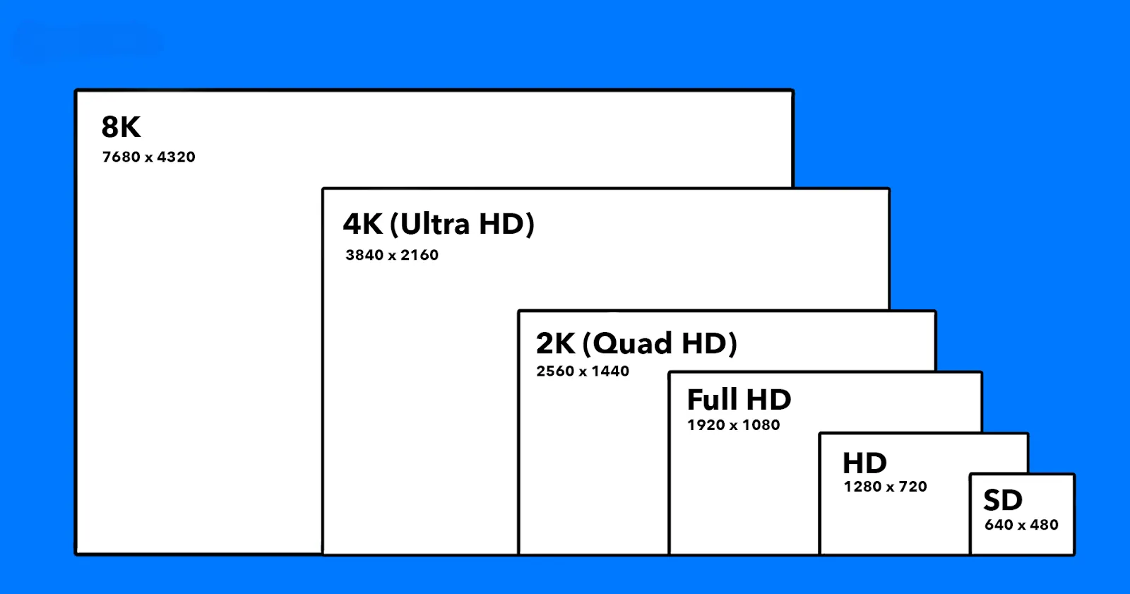
1. Get the Native Number.
This is your magic number. Don't guess. Ask your AV integrator or display provider for the screen’s exact native resolution (e.g., 1920 x 1080). Not just the pixel pitch. Not an estimate. The exact number.
2. Design to That Exact Spec.
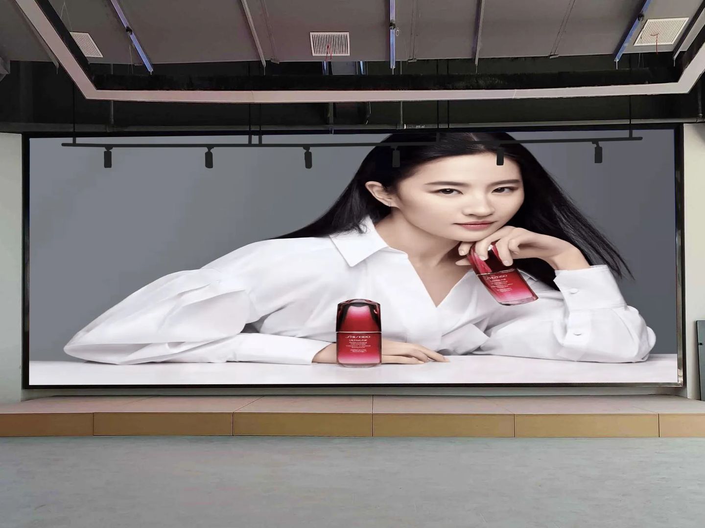
This is the golden rule. Create your content at the exact resolution of the screen. One pixel of your content to one pixel on the display. This "pixel-for-pixel" mapping is the secret to razor-sharp clarity.
3. When in Doubt, Go Big & Proportional.
If a perfect match isn't possible, provide a file that is larger than the screen's resolution but maintains the exact same aspect ratio (e.g., 16:9). Let the high-quality processor in your system downscale it. A good downscale always looks infinitely better than a bad stretch.
Build a System, Not Just a Workaround
Make perfection a habit:
Create a Spec Sheet: Have a one-page document for your team and vendors with the resolution, formats, and safe zones for every screen you own.
Use a Quality Media Player: A professional-grade player handles scaling and color correction far better than built-in software.
Preview, Always: Never skip the step of checking your content on a test monitor or requesting a preview from your display operator.
A Final Thought
The most powerful component in your visual tech stack isn't the hardware. It's the preparation.
The most impactful upgrade to your digital signage often isn't a newer screen—it's the deliberate choice to match your brilliant creativity with perfectly tailored technical specs. Because your message doesn't just deserve to be seen. It deserves to be seen at its absolute best.